 posy
posy


An aesthetic link in bio is not one with the most decoration. It is one where everything agrees with everything else. The colours belong together, the pictures feel like a set, and nothing on the page is trying too hard.
That is good news, because it means you do not need design skills. You need a few decisions made once and then left alone. This guide walks through them in the order I would make them.
#Start with a mood, not a template
Before you open any editor, pick two or three words for how the page should feel. Cosy and warm. Quiet and printed. Dark and sharp. Playful. Having the words stops you choosing things one at a time and ending up with a page that feels like a collage of ten moods.
Here is how those moods map onto the six looks in Posy:
- Warm and cosy: Desk or Painted
- Quiet and printed: Washi
- Playful: Lofi
- Editorial and graphic: Cobalt
- Dark and sharp: Night
Other tools have their own versions of this. The point stands anywhere: choose the mood, then choose the look that already has it.
#Pick the look that already has the mood
A look in Posy is a whole scene, not a colour scheme, so choosing one does most of the design work for you.
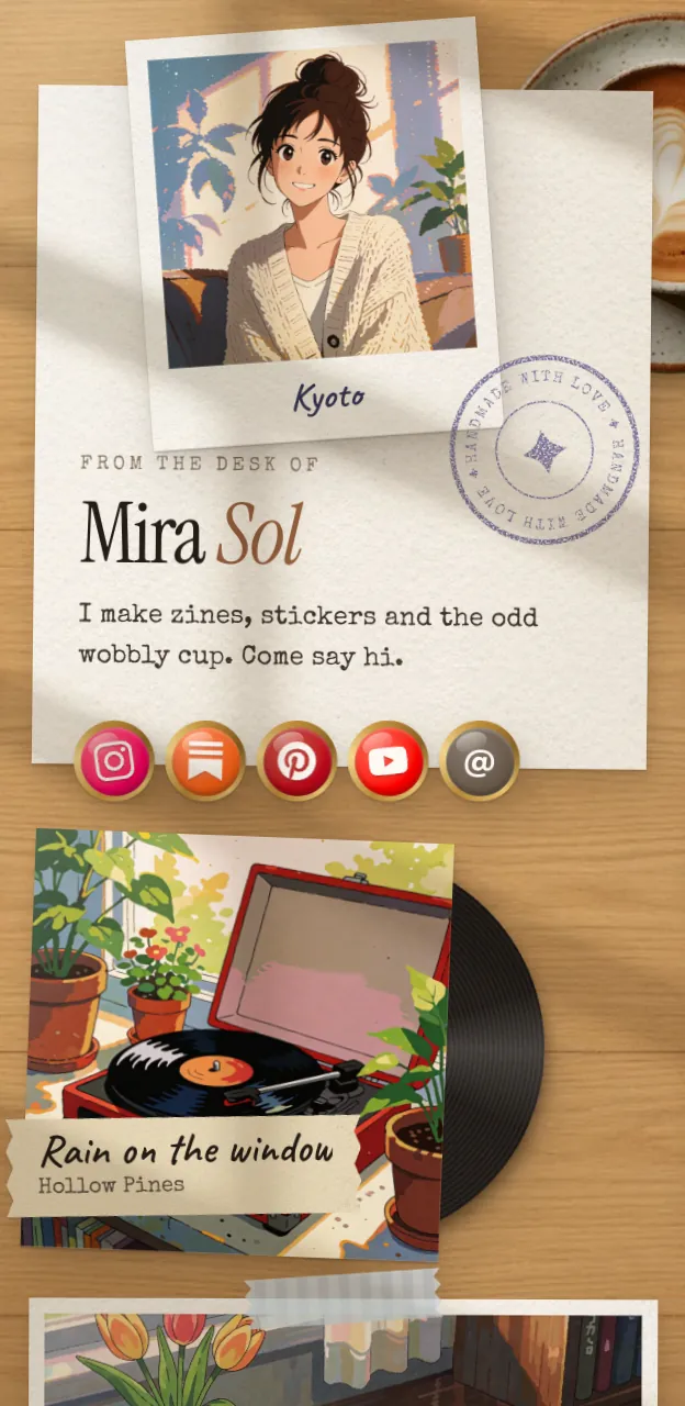
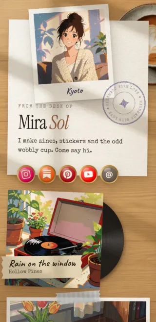
Desk turns your links into things on a sunny desk. Images become polaroids, notes become sticky notes, a Spotify link becomes a record, and a YouTube link becomes a ticket. It is free.
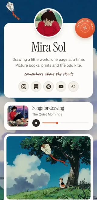
Painted puts cream paper cards under a painted sky that drifts slowly behind them. It is the calmest of the six, and it is free.
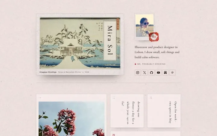
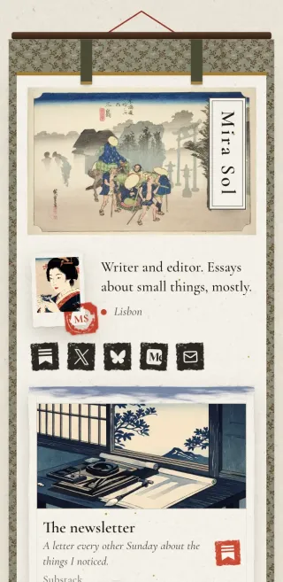
Washi is a Japanese woodblock print with your name on a title slip and a red seal carrying your initials. It comes with Pro.
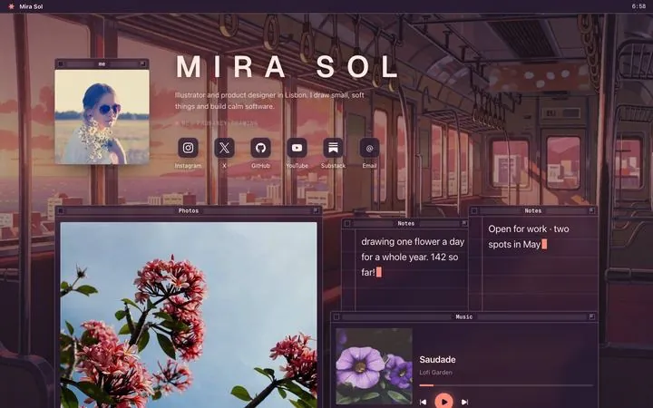
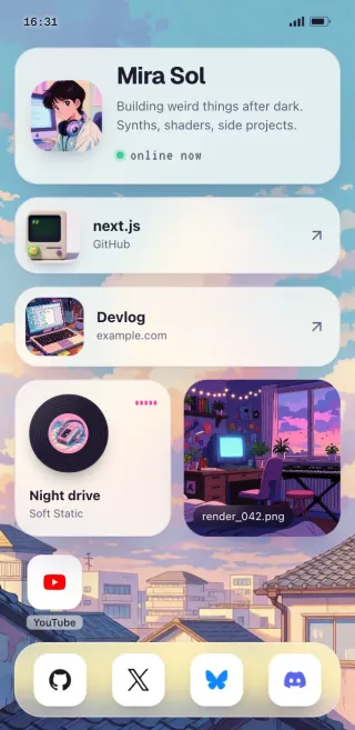
Lofi is a little desktop, where every link is a window your visitors can drag around. It is free.
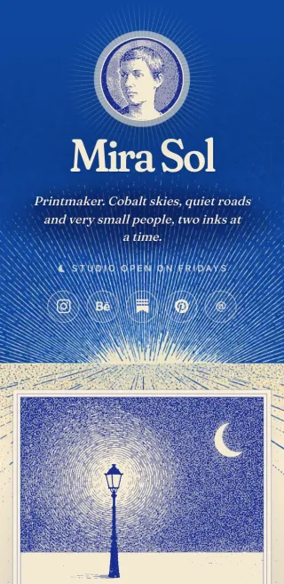
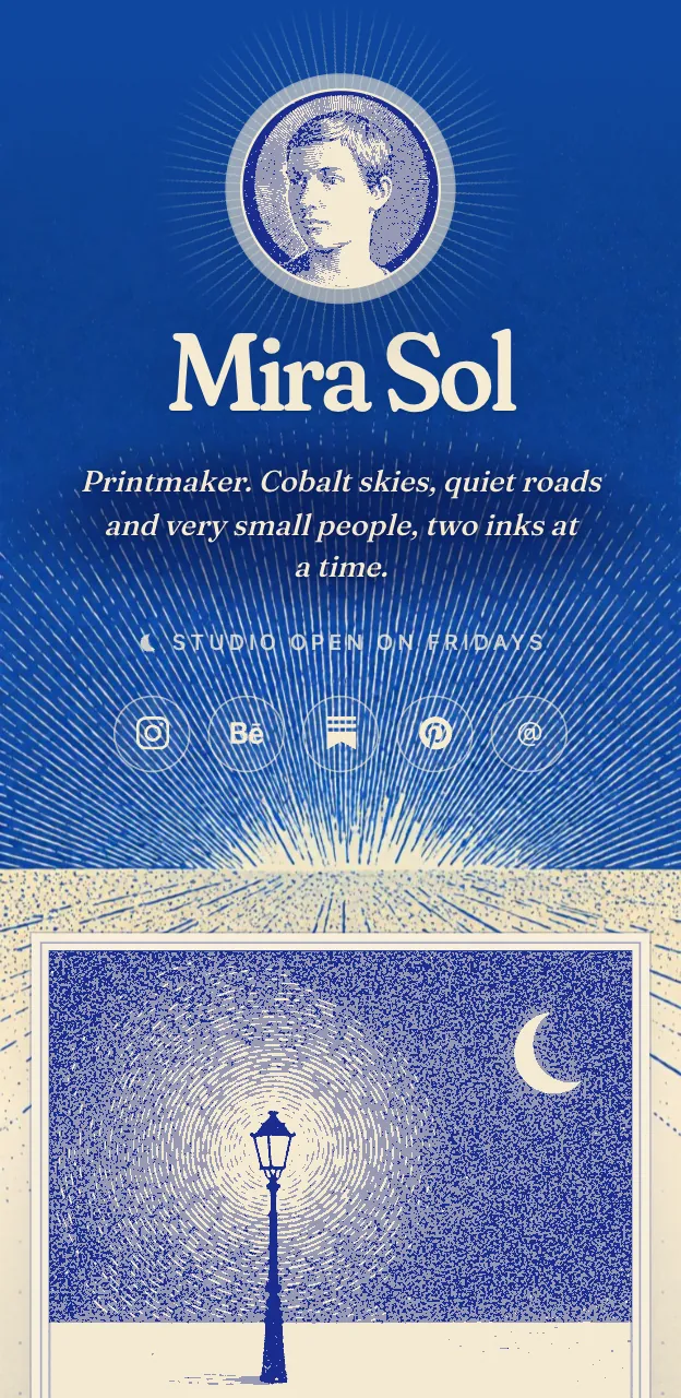
Cobalt is a vintage print in two inks. It reprints your photos in cobalt and cream and numbers your links like plates. It comes with Pro.
Night is a netrunner's heads-up display with scanned photos, cut-corner panels and one signal colour. It comes with Pro.
Not sure? Open the looks gallery and look at each on a phone, since that is where your page will mostly be seen.

#Choose one palette and stick to it
Each look has four palettes. Desk has Cream, Oak, Sage and Slate. Painted has Morning, Golden hour, Dusk sky and Starry. Cobalt has Cobalt, Vermilion, Moonlit and Verdigris.
Pick the one that matches the mood words and leave it there. If you want to go further, you can set any accent colour of your own. A good rule is to choose an accent from something you already have: your logo, your cover art, your brand. A page that repeats one colour from your other work feels intentional, and people recognise you before they read your name.
#Let the fonts be quiet
Posy lets you pair fonts, from editorial serifs to mono. Resist the urge to be clever. A serif heading with a plain body font is almost always right. A mono pair suits developers and tech people. A handwritten pair can be charming for a hobby page and tiring for a business one.
Whichever you pick, the rule is the same as for colour: choose once, and do not change it for each section.
#Treat photos as a set
Mismatched photos are the quickest way to make a page look messy. A bright product shot next to a dark moody portrait next to a screenshot never feels like one page.
Posy has a photo style setting that helps. It can show photos natural, in mono, dithered or as ascii. Switching the whole page to mono makes unrelated photos read as a series. Cobalt does something similar with its two inks.
If you stay with natural colour, at least keep to a shared crop. Squares with squares, or tall with tall, and a similar amount of light. Fewer, better pictures beat many average ones. If you are staying on Linktree, see how far its themes go and the right background image size.
#Show fewer things
This is the one that matters most. An aesthetic page has room around things. Most people add every link they have, and the page turns into a wall.
Try this instead.
- Pick one main thing. The thing you most want a visitor to do. Make it the largest tile.
- Add two or three supporting things. Your best work, a newsletter, a shop.
- Put socials in a row of small tiles. They are for finding you, not for reading.
- Delete anything that has not earned its spot. If nobody has clicked it in a month, it is clutter. Posy shows you taps for each link.
Four to eight tiles is plenty for most people.
#Use size to say what matters
Posy tiles come in four sizes: small, wide, tall and large. Use them like headlines. The tile you want people to open first gets large or wide. Everything else stays small.
If you want to be more deliberate, add a heading tile to start a new group, such as "Listen", "Read" or "Elsewhere". Groups give the eye somewhere to rest.
#Choose a layout on purpose
Posy has three layouts.
- Bento is a grid of tiles. It shows more at once and suits most pages.
- List is one column of links. It is the quietest, closest to a classic link page.
- Canvas lets you place tiles anywhere, tilted a few degrees if you like. It is the most personal and the most work.
If you are not sure, start with bento. You can switch later and your links stay put. Under 600 pixels a canvas page becomes a single column, so it stays readable on a phone.
#Write like a person
Words are part of the look. A short, warm bio does more than a clever one.
- Say what you do in plain words: "Illustrator in Lisbon. Zines, stickers, the odd cup."
- Use a short note tile for what is happening now: "Commissions open until November."
- Name links by what is behind them: "Listen to the new EP" beats "Click here".
Skip the exclamation marks and the emoji strings. A calm page reads as confident.
#Check it on your phone
Open the page on your phone, ideally from inside another app, the way a visitor will. Look for these things.
- Is the main thing obvious in the first screen?
- Can you read everything without zooming?
- Do the photos still look like a set?
- Does the page load quickly?
Then check it once in a dark colour palette and once in a light one, if your look has both. A page that works in both has been designed properly.
#A five-minute version
If you want the short path, here it is.
- Pick a mood and a look. For a first page, Painted or Desk are good because they are free.
- Pick a palette. Leave it alone.
- Add your main link as a large tile, and two or three supporting ones.
- Set photos to one style across the page.
- Write a two-line bio.
- Publish and check it on your phone.
An aesthetic link in bio is mostly restraint. Make a few decisions, repeat them, and leave room. Everything else is detail you can change later without breaking anything.